Chicago Blackhawks Rebrand
September 2024
Project Overview
Client Class Project
Role Student
Duration Fall Quarter 2024
Role Student
Duration Fall Quarter 2024
Objective
To modernize the Chicago Blackhawks’ identity by connecting the team’s name more closely to hockey, honoring Chicago’s history, and preserving key elements of the original branding for a bold, timeless look.
To modernize the Chicago Blackhawks’ identity by connecting the team’s name more closely to hockey, honoring Chicago’s history, and preserving key elements of the original branding for a bold, timeless look.
Overview
The Chicago Blackhawks' rebranding was inspired by the recent trend of modernizing sports teams' identities while paying homage to their cultural and historical roots. While iconic, I felt that the current logo didn't fully represent the name "Blackhawks" or emphasize its connection to hockey.
This project challenged me to preserve the essence of the team’s existing brand, especially the well-known color palette while introducing stronger ties to the Blackhawk bird and hockey. The ultimate goal was to create a bold, modern design that respects tradition while delivering a fresh perspective.
Process
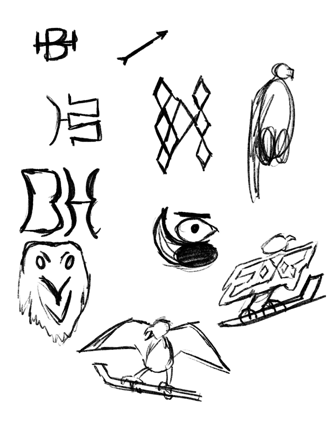
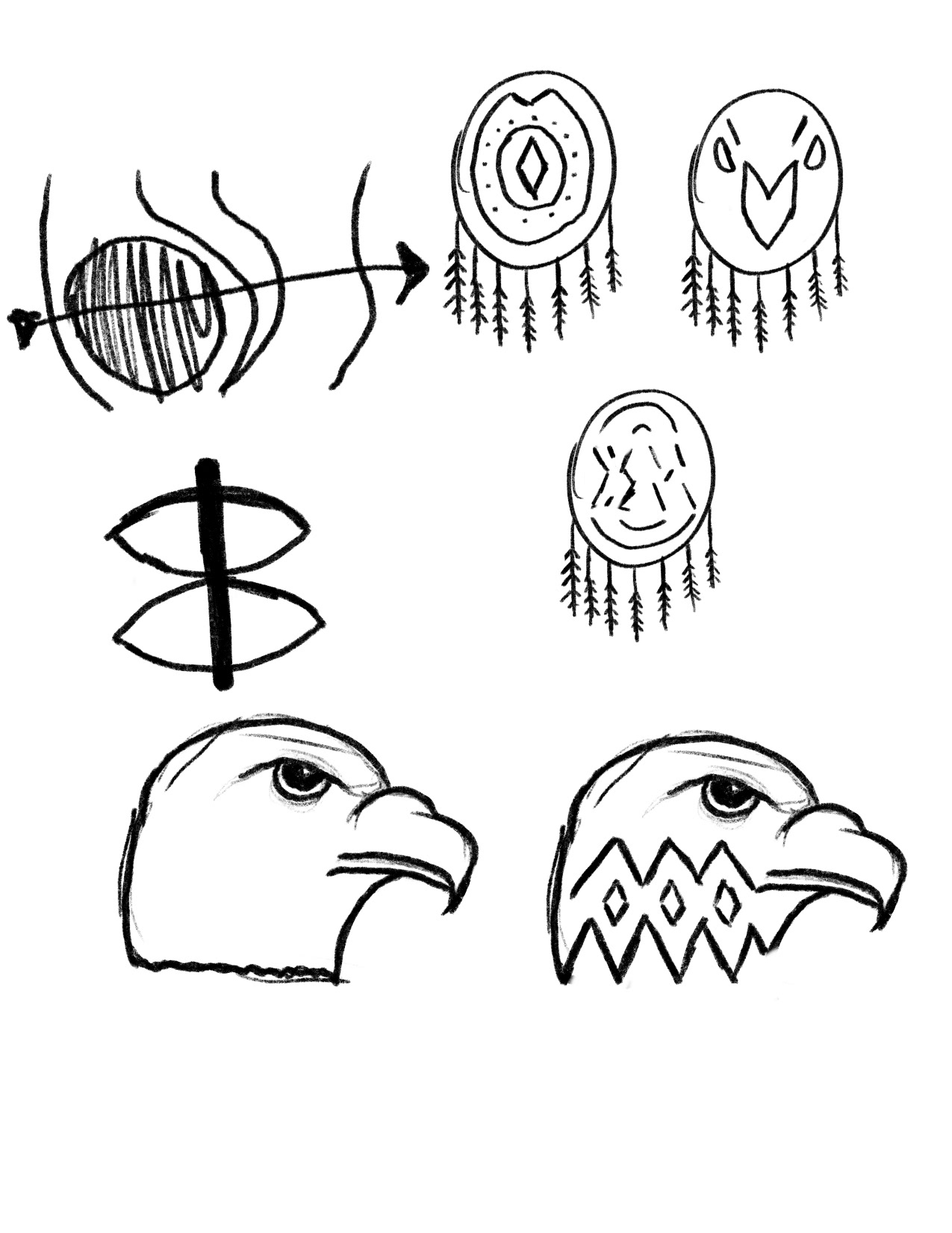
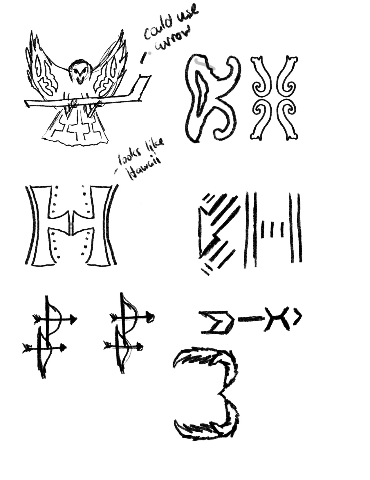
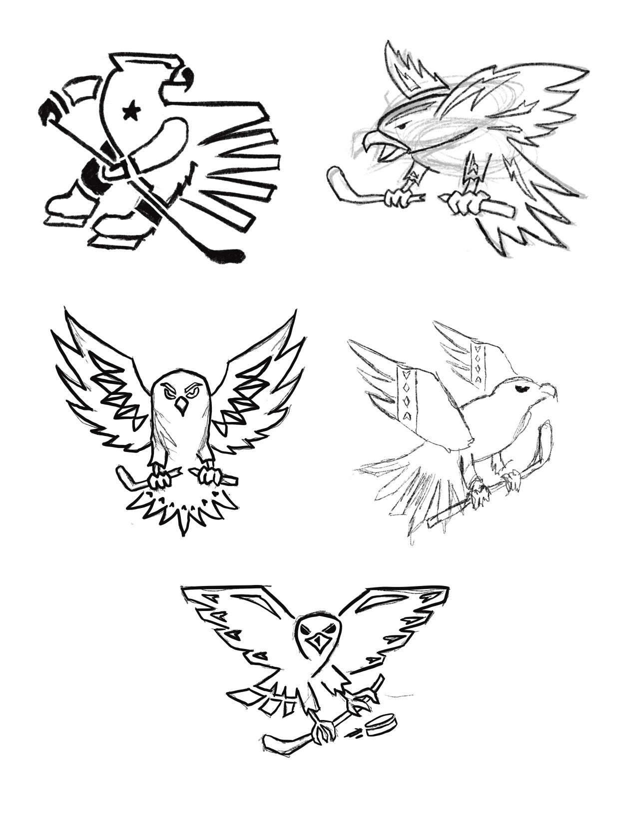
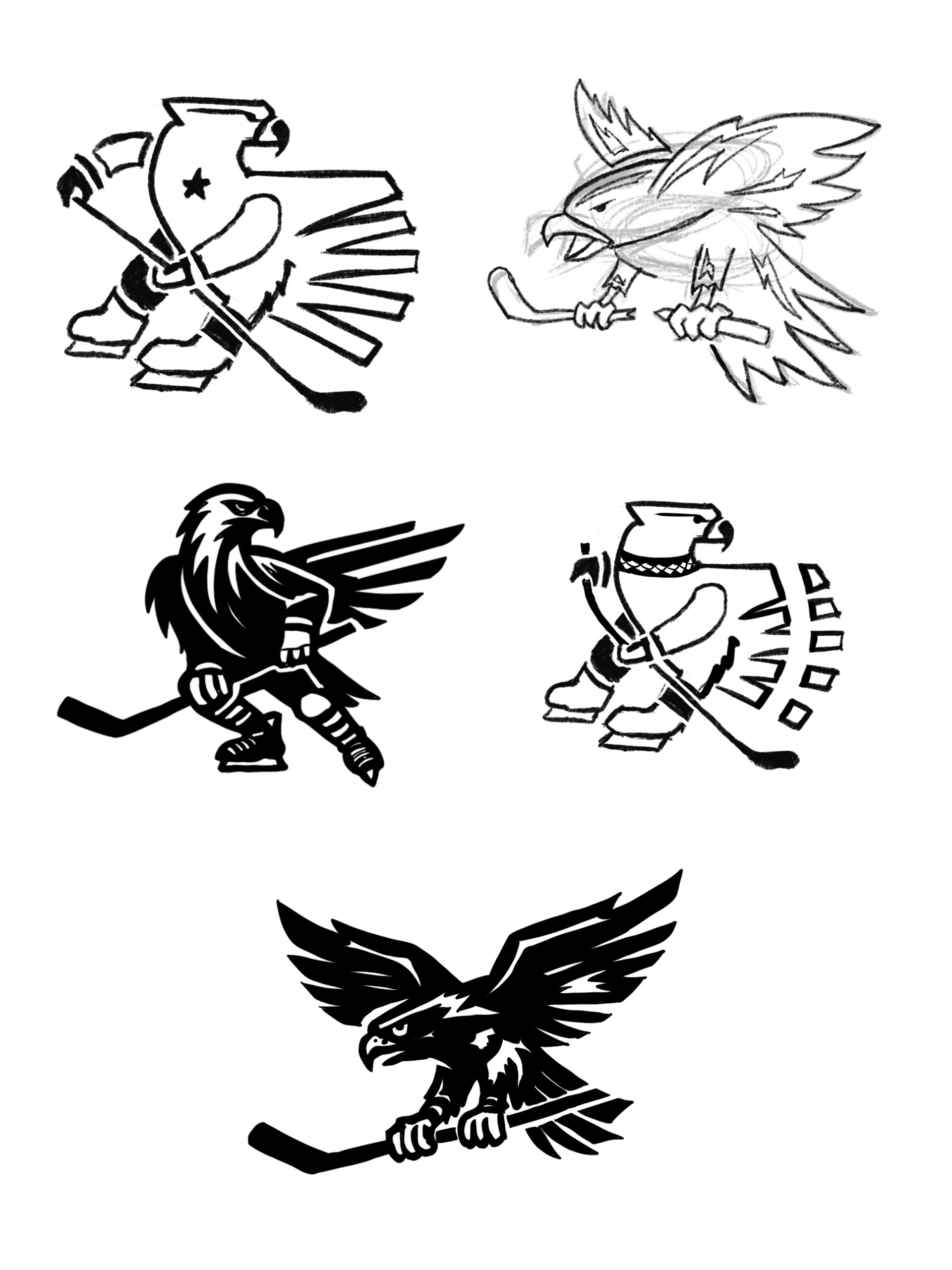
The rebranding began with in-depth research into the team’s history and the origins of the name "Blackhawk." This laid the groundwork for my initial ideation sketches, helping me define a direction that stayed true to the brand while incorporating more hockey-specific elements.
The only Native American cultural influence retained from the original design was the color palette, which I saw as deeply connected to the team’s heritage and fanbase. My research relied on peer-reviewed resources to ensure historical accuracy and cultural respect.
Final Design
The primary logo features a striking Blackhawk bird on ice skates, clutching a hockey stick. The bird’s wings are multicolored, with four distinct sections that pay tribute to the four stars on Chicago’s flag. This design directly connects the team’s name and city while grounding it firmly in hockey.
The typography complements the logo with a rugged yet refined style. It draws subtle inspiration from Native American artistry while maintaining the versatility and clarity required for modern branding.
Additional Materials
To visualize the rebrand, I created mockups for the team’s arena and uniforms, showcasing how the updated logo and design elements could come to life. These materials demonstrate how the rebrand fits seamlessly into the team’s identity, both on and off the ice.
Future plans include expanding the concept with additional materials, such as merchandise designs and promotional assets, to fully realize the potential of this new brand identity.
Lessons Learned
This project taught me the importance of balance in a rebrand, retaining key elements that resonate with a fanbase while introducing meaningful updates. I discovered how crucial the research phase is for understanding cultural significance and historical context, mainly when working with sensitive topics like Native American heritage.
Additionally, I learned that practical considerations, such as scalability and alignment with existing brand elements, often constrain design choices. These challenges pushed me to think creatively, ensuring the new design felt fresh yet familiar. Finally, this experience underscored the value of incorporating feedback and remaining adaptable as a firm rebrand evolves through iteration and refinement.
